Design reference: a public website by another company, shown for its design. It is not Groow client work.
Wastetide
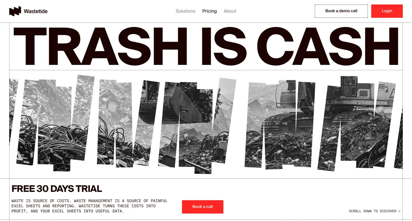
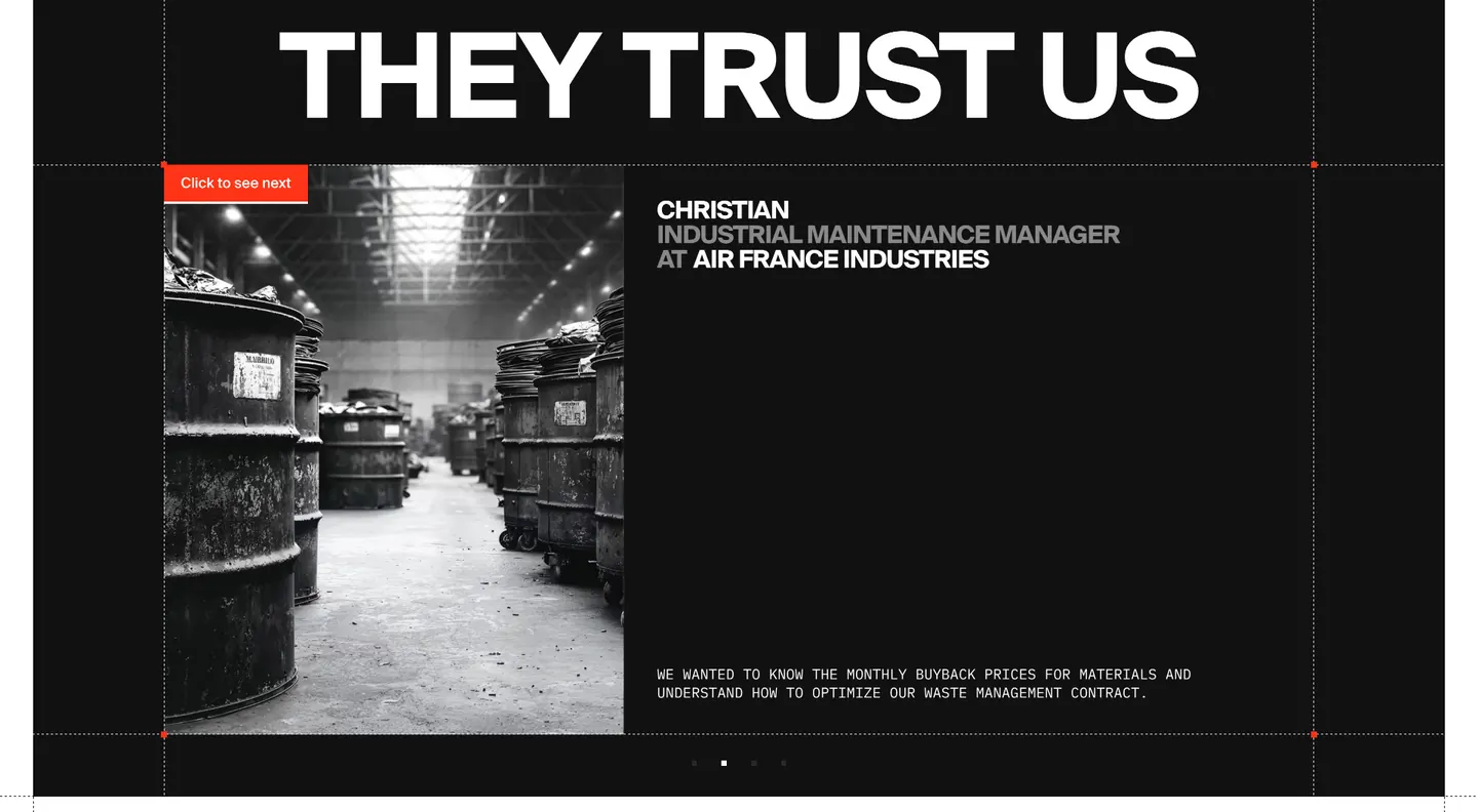
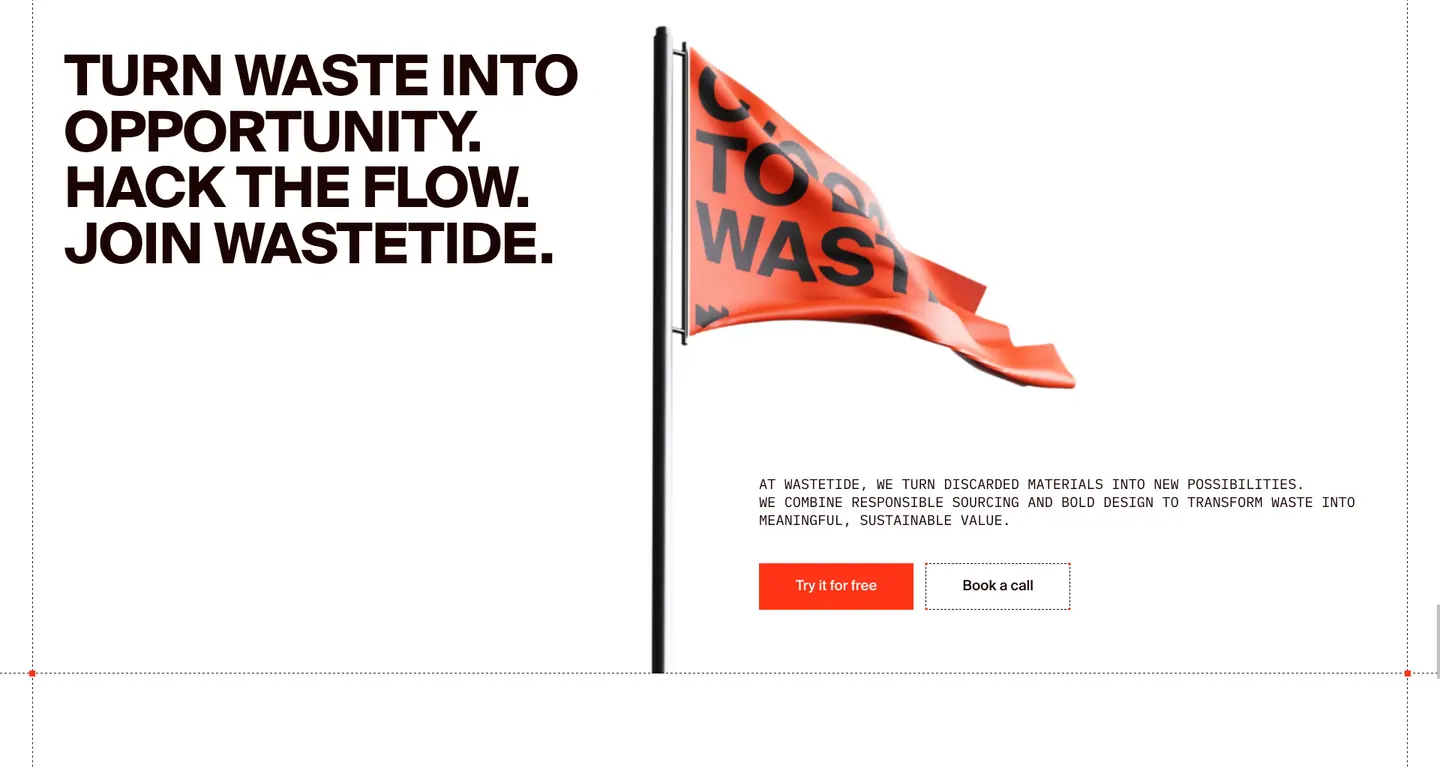
Shouting black headlines, signal red and grainy photography turn a waste-management offer into a manifesto.
- Climate & waste
- SaaS website
- Brutalist type
- Website
- Wastetide
- Sector
- Climate & waste
- Scope
- SaaS website, Brutalist type
- Good reference for
- Climate, impact and B2B services that need a manifesto voice: loud headlines, one signal colour, raw photography.
Colour palette
Extracted from the page itself, from the most used colour to the accents.
- #ffffff
- #121212
- #fc2b23
- #bab5b5
What stands out
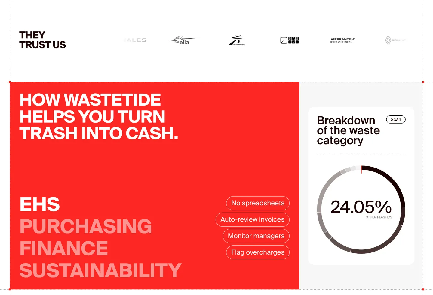
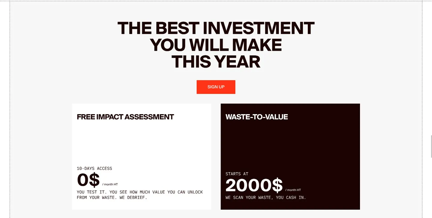
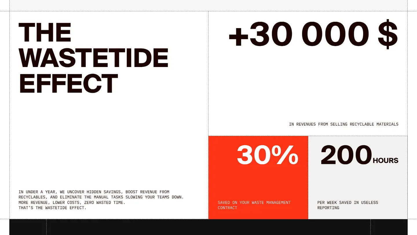
Big numbers and blunt statements replace feature lists. The red is reserved for actions and key figures.
Section by section
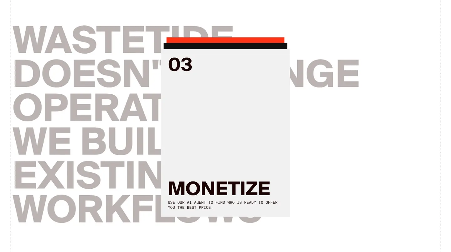
The homepage cut at its natural breaks, so each part can be read on its own.
Related projects
Let’s build what your business needs next.
Tell us where you are and where you want to be. We’ll come back with a clear, honest plan.